Case study · Self-initiated
Ledger Treasury
A treasury application built to hold the density of the real thing — cash, payments, portfolio, reconciliation and invoicing under one shell, with the state and permission rules that make those screens hard to design.
What this is, and what it is not
Ledger is my own project, built to a domain I work in daily. Every entity, counterparty and figure on these screens is synthetic — Acme Corporation and Vendor Alpha, not a real client. There are no users, no revenue and no measured outcomes to report, and I am not going to invent any. What the screens show is the design work: how dense financial state is ranked, how permissions become layout, and what the interface does when a record is incomplete rather than when everything is fine.
Cash position
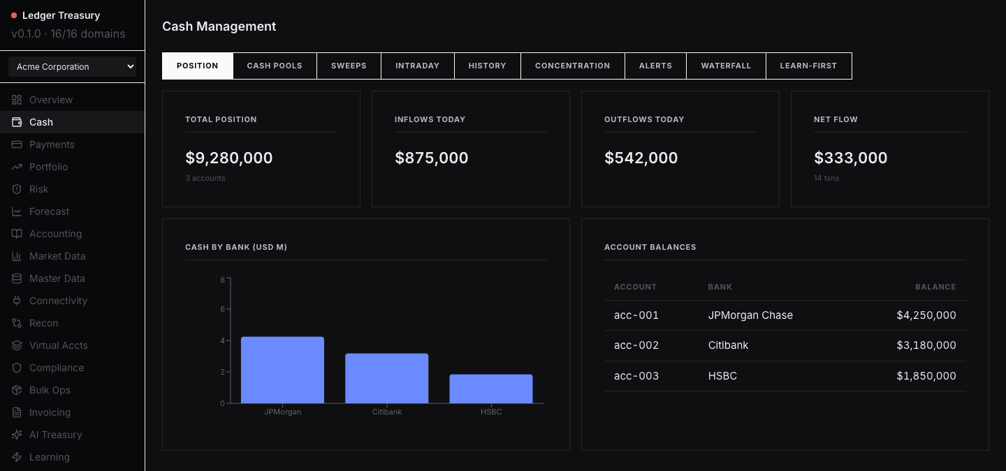
The first question a treasury screen has to answer is how much cash there is and where it sits.
Four figures carry that answer above the fold. Nine tabs of further depth stay one click behind them, so the summary never competes with the detail.
Payments approval
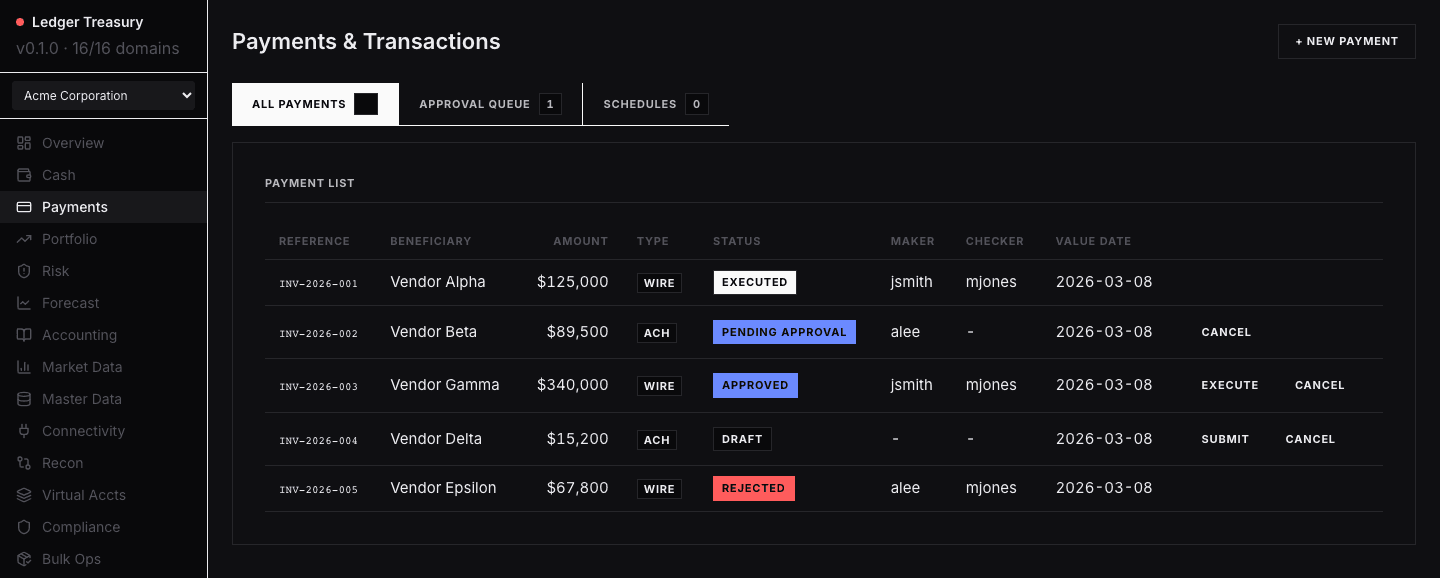
A payment queue mixes drafts, pending approvals and rejections, and the wrong control on the wrong row is expensive.
Maker and checker are columns rather than a modal, and each row exposes only the actions its status permits. The interface cannot offer an approval that is not available.
Portfolio holdings
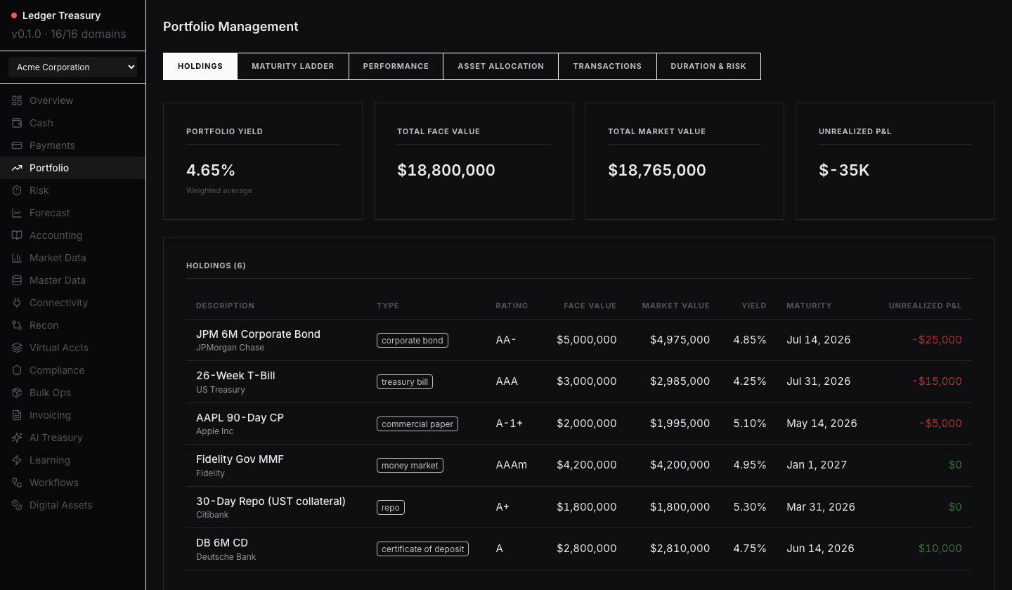
Bonds, bills, commercial paper, money market funds, repo and deposits carry different attributes but belong in one holdings view.
Typed chips replace a legend, tabular numerals hold the columns steady, and colour appears only on unrealised P&L — so the one number that changes is the one the eye finds.
Reconciliation exceptions
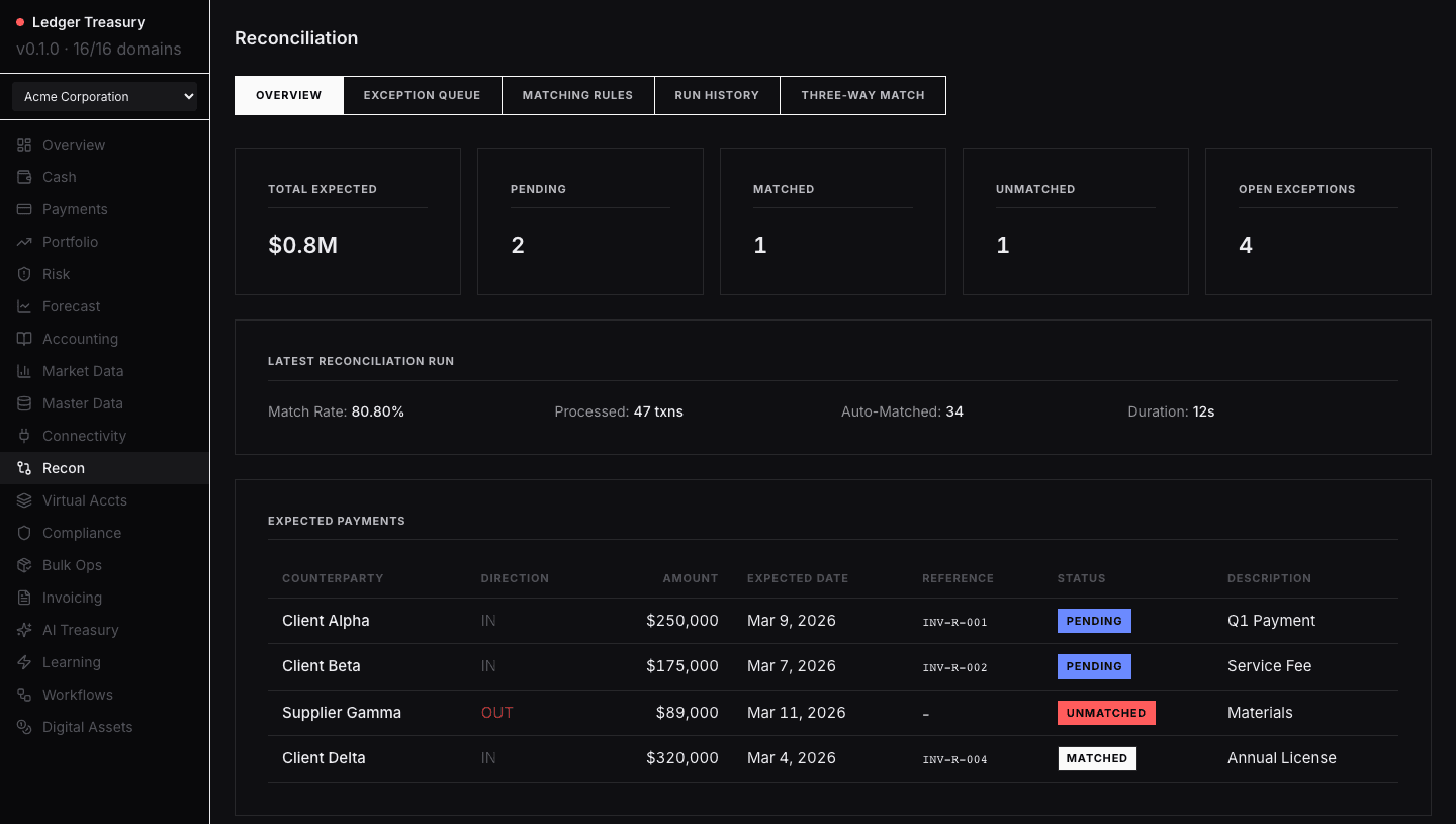
Reconciliation views tend to collapse several distinct conditions into a single bucket called exceptions.
Pending and unmatched are separated, status is one chip per row, direction is the only coloured column, and the run summary sits above the rows it explains.
Invoicing, AR and AP

Receivables and payables share a table, so two opposing record types have to stay separable without a key.
Type is a chip, status is a single filled token, and the ageing is carried by the issued and due columns rather than by a separate indicator.
The system underneath
The screens are the visible half. The half that keeps them consistent is a token layer the components are not allowed to bypass, and a test suite that treats a visual change as a diff to approve rather than something to notice later.
- 21 domain screens and 125 tabbed sub-views behind a single shell
- Four-tier role model — viewer, analyst, treasurer, admin — enforced in the API, not the UI
- Role-specific drill-down templates for CFO, risk manager and group treasurer
- Every domain ships a committed visual-regression baseline
- A custom lint rule fails the build on any hardcoded colour or spacing value
React · TypeScript · Vite · FastAPI · SQLite · Playwright